5 tips for choosing a good font for sticker design and printing
15 September 2015

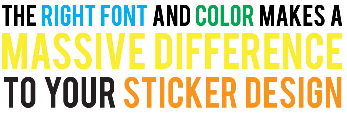
Picking a good font is a super important part of your sticker design process. The wrong font can make your stickers look unprofessional, and the right one can make it stand out amazingly! Here are a few tips and places when picking a font, and a few good links to getting them for free!
- Don’t use comic sans, impact or papyrus – these fonts are in everyone’s MS word program, and hurt peoples eyes. Well not really, but they are terrible and should be avoided like the plague.
- Don’t use overly graphic fonts when you need a simple font – ie don’t use old english or a very cursive font if you want people to read a word easily
- Do spend 5 minutes searching font websites such as www.dafont.com or www.fontsquirrel.com and have a look – all of fontsquirrels fonts are FREE for commercial use
- When supplying your files for printing stickers, make sure that you either supply the font file itself, a link to download it from OR ideally have the font converted to outlines in whatever editing programs you are using.
- For die cut stickers, make sure that you have the font larger than 10mm, and don’t make it too complex!
Remember, a font is there to help you send a message, convey information or to make your sticker recognisable – if it is hard to read, or if it is rubbish, people will know – and your stickers won’t work as well as they could!
PS – comic sans is so bad, there is even a page helping you not be a comic sans criminal – check it here..!
Want a free sticker quote? Click here!