
Printing Stickers and Pantone Colors
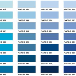
Printing Stickers with Pantone Colours
Pantone colour codes are used around the world to create more consistent colour matching. Instead of trying to describe a colour as “dark blue” or “bright red”, a Pantone code gives printers and designers a specific colour reference to work from.
When printing custom stickers, Pantone colours are useful when colour accuracy is important. This is especially true for logos, brand colours, packaging labels and repeat orders where you want the finished stickers to look as consistent as possible each time.
Pantone Colours and Screen Printed Stickers
For screen printed stickers, Pantone colours are the best way to achieve a very close colour match. Screen printing uses spot colours, which means each colour is mixed and printed separately.
If you have a specific Pantone colour for your logo or brand, we can use that as a reference when mixing the ink. This gives a much more accurate result than guessing from a screen image or printed sample.
Screen printing is often a good option for larger quantities where exact colour matching is important.
Pantone Colours and Digitally Printed Stickers
Digitally printed stickers are printed using a CMYK process. CMYK stands for cyan, magenta, yellow and key, which is black. These four colours are combined in different amounts to create the final printed result.
Because digital printing uses CMYK rather than mixed spot colours, Pantone colours are converted to the closest CMYK equivalent. This means the result can be very close, but it may not be a perfect match.
We use Pantone to CMYK conversion references to help match your colour as closely as possible. For most sticker jobs, this gives a good result. However, some Pantone colours, especially very bright, fluorescent or metallic colours, cannot be matched exactly with standard digital printing.
Die Cut Vinyl Stickers and Pantone Colours
Die cut vinyl stickers and decals are usually cut from existing rolls of coloured vinyl. These vinyl colours come in a set range, which covers many common colour options.
If you need a very specific Pantone colour, standard cut vinyl may not be suitable. In that case, we would usually recommend digitally printing the sticker and then cutting it to shape. This gives more flexibility with colour and design.
What Can Affect Sticker Colour?
There are a few things that can affect how a colour looks once your stickers are printed.
The sticker material can make a difference, as colours may appear slightly different on white vinyl, clear vinyl or paper stock. The finish can also affect the final look. For example, a gloss laminate can make colours appear brighter, while a matt laminate can make them look softer.
Lighting also plays a part. A sticker may look slightly different indoors, outdoors, under fluorescent lighting or in direct sunlight.
Do Not Rely on Screen Colours
It is important to know that the colour you see on your computer screen is not always accurate. Every screen is calibrated differently, and brightness, room lighting and reflections can all affect how a colour appears.
A Pantone colour found online can be used as a rough guide, but it should not be treated as an exact colour sample. It might help confirm that you are choosing a teal rather than a pink, but it will not guarantee the finished print colour.
The most accurate way to check a Pantone colour is with a physical Pantone swatch book. These can be expensive, but if colour accuracy is critical to your brand or sticker design, it can be worth the investment.
Need Help Matching Sticker Colours?
If you have a Pantone colour you want matched, send it through with your artwork or quote request. We can advise whether screen printing, digital printing or cut vinyl is the best option for your sticker job.